What is Artistic Composition?
Geometry and the Subconscious


When creating a portrait, how does the artist decide where she places her figures? When crafting his famous landscapes, how did Bob Ross decide his mountain should rise from the right side of his canvas, and his happy little trees cradle the left? Deciding where elements should appear in an artwork is called composition. In his book “The Painter’s Secret Geometry” the artist and aesthetic theorist Charles Bouleau calls composition the internal construction of works of art—meaning that once you've decided what you'd like to paint, composition is the process of deciding how you’ll paint it.
Composition is the application of the Elements of Art, i.e. line, shape, and color, according to the Elements of Design, like rhythm, balance, variety, etc. If we're being honest, for many artists it’s a largely intuitive process. An experienced artist, designer, writer or musician understands how to arrange elements to create the impact they want. But these decisions are not random or arbitrary, because even the most unusual composition is a three-part process where the artist’s decisions engage with the viewer’s perceptions, and mathematical attributes of the artwork.
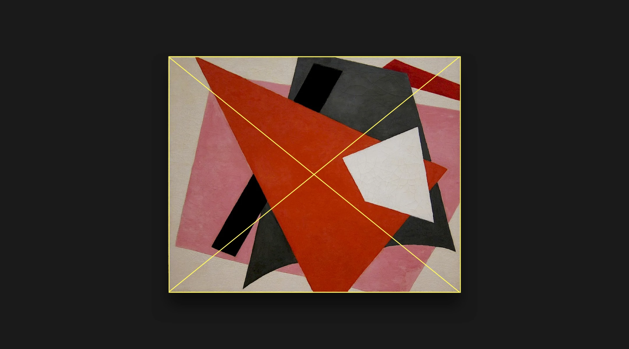
Every artwork has a set of fundamental characteristics. For instance, every rectangular image can be subdivided horizontally and vertically into halves, thirds, or quarters. Lines can be drawn between opposing corners to intersect in the center, etc, etc.
These inherent constraints, the shape and geometry of the artspace, shape the subconscious expectations of the viewer. When approaching an artwork, the human eye looks for a place to beginning examining the work—this is called a focal point. From the primary focal point, our eyes move across the space to the next focal point, and the next, and so on, until we return to the primary focal point or change our position, backing out to view the work as a whole, or leaning in for detail.
The placement of focal points within an artwork affects how it makes us feel. When focal points align with the inheirant geometry of the artspace, the work may feel harmonious. Placing focal points near the extreme edges of the space, or grouping focal points too closely may create a feeling of tension or disharmony. Where do these expectations come from? The theory goes that human brains are wired to identify patterns. When we look at an artwork, our minds measure the composition of the artwork against its underlying mathematics. We are subconsciously dividing the artspace into 1/2, 1/3, etc, and when focal points align to those divisions, our brain says ‘I was right!’
And this is where the artist’s decisions kick in. When laying out their artwork, artists have to reckon with these two forces: the shape and geometry of the space, and the expectations of the viewer. Artists through history have experimented to find the best way to create harmonious compositions that please the viewer and lead the eye on a journey through the work. Some artists intentionally disrupt the conventions of composition, hoping to create unnerving, difficult work, and many artists ignore these factors or work in ignorance of them, letting their taste, preferences and instincts guide the way.
There is no right or wrong way to compose an image or fill a sculptural space, but understanding common composition techniques and some of the unique methods devised can help you understand how artists through history have aimed to guide your eyes and play with your mind, and might inspire you to create your own pleasing compositions, or to try and break all the rules.